Creating and Managing Business Analytics Graph Widgets | AT&T Office@Hand
Article# 98764
This article provides information on how to create and manage analytics graph widgets.
The Business Analytics graph widget lets you create a visual representation of your data. You can use this widget to:
- Visualize call handling patterns over time.
- Identify peaks and dips in call staffing.
- Compare multiple members and their performance for inbound or outbound calls.
Creating a graph widget
- In your Business Analytics dashboard, click the Add Widget tile.
- Select Graph.
- Choose Trend or Comparison.
- Trend graphs show the most popular times for calls to your organization.
- Comparison graphs let you see how data differs between calls.
- Give your widget a name in the Widget Name field.
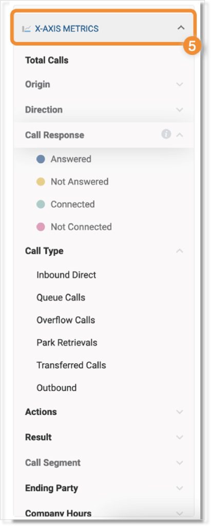
- Double-click or drag any item from the X-Axis metrics section to add it to the graph. You can see the definition for each by clicking the Info button to the right of the option.
NOTE: You can select more than one item from the x-asi list.

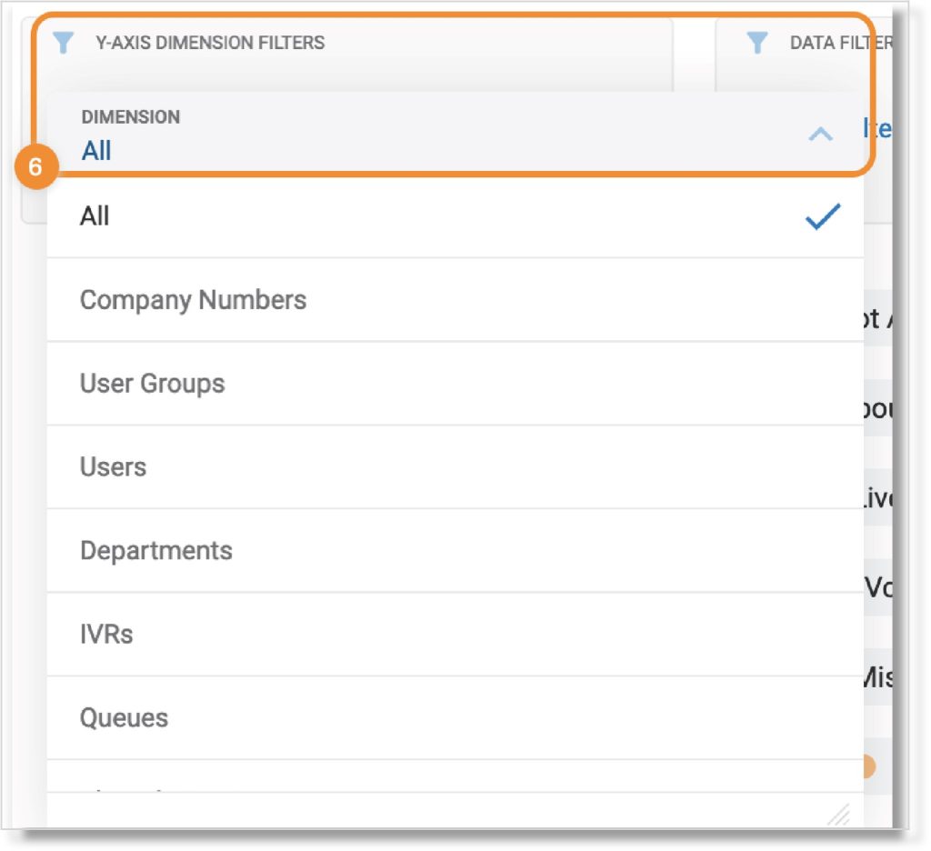
- In the Y-Axis dimension filters box, click the dropdown to select the dimension you want to measure.
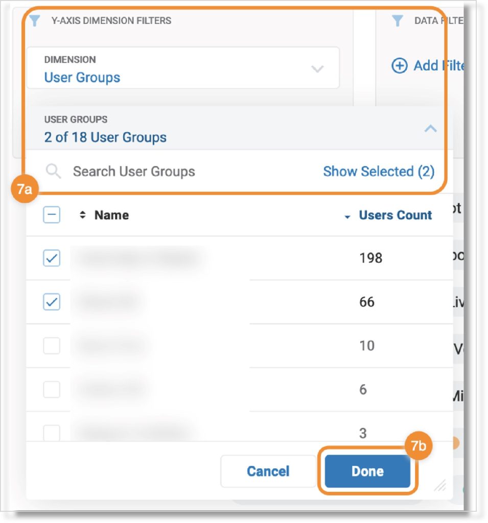
- Filter the data further by clicking the dropdown and checking the box(es) next to the available options whose data you want to see. Then click Done.

- Click Save at the top right.
Viewing data in the graph widget
You have two options for viewing data in the graph widget, depending on what you want to see.
Using the data range function
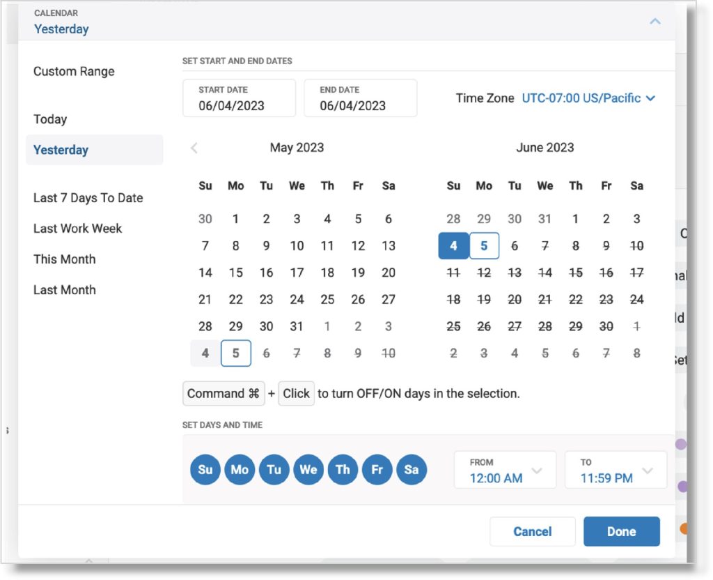
Click the calendar button to the right of the widget name to select specific date ranges and timeframes. You can select from the preset date range options, change the timezone, enter a custom date range, select hours to include data from, and/or specify data from certain days of the week.

Click Done to save your preferences. The graph will update to display data for the date range specified.
Using the Aggregate Function
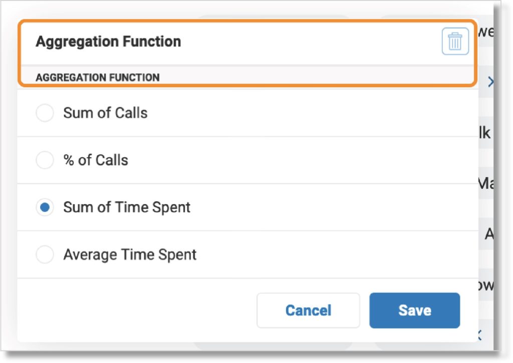
You can display two types of aggregated data using the Aggregate Function option. By default, the graph’s aggregate function will be Sum of Calls. Click to select another function, then click Save.

To add another function, click the Add Aggregation Function button.

Choose another function from the dropdown, then click Save. Another graph will display the data for the function you’ve selected.
Selectable options for the aggregate function:
- Sum of calls
- % of calls
- Sum of time spent
- Average time spent
- % of time spent
Filtering data in the graph
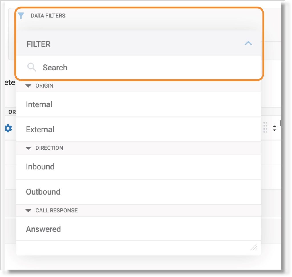
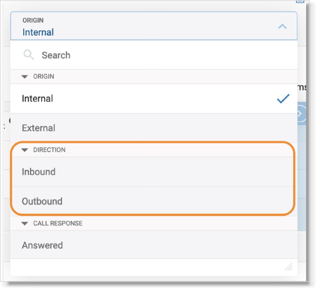
You can filter data for the selected row category if you want to see a specific slice of information. Click the dropdown in the Data filters box, then select the filter(s) you want to use.
- Origin
- Direction
- Call response
- Call type
- Result
- To/From extensions
- Ending party
- Call length
- Time spent
- Actions
- Call segment
- Queue SLA
- Numbers called
For a full list of descriptions for each data filter type, read the Business Analytics data dictionary.

You can add multiple filters by clicking the Add filter button. You can add only one filter at a time.

Depending on your previous data filter selections, some options may be grayed out.

To remove all data filters, click the trash icon at the far right.
Clearing a graph
Click Clear at the upper right to undo your last change in the graph widget. It will disappear once you click it, then reappear when you make your next change to the graph.

Managing a graph widget
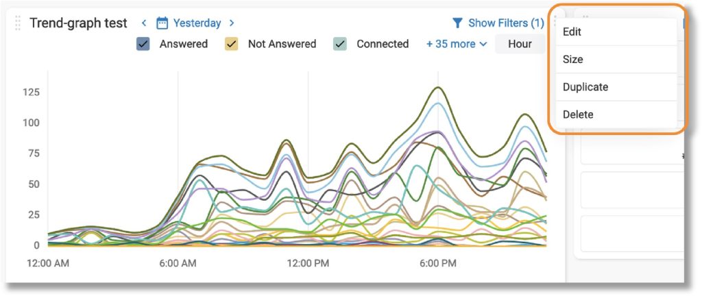
Once you save a graph widget, it will appear in your dashboard on the Business Analytics page. From here, you can perform several actions by clicking the three-dot More icon at the top right of the widget.
- Edit: Open the graph widget page to make changes.
- Size: Resize the widget in the dashboard.
- Duplicate: Create a copy of the graph widget.
- Delete: Erase the graph widget.

Additional resources:
Key Words: AT&T Office@Hand, Business Analytics, Analytics, graph widgets, create graph widgets, view widget data, aggregate function, data range function
Was this page helpful? Yes No
