Adding Widgets to a Business Analytics Dashboard | AT&T Office@Hand
Article# 98770
This article provides information on how to add widgets for the AT&T Office@Hand Business Analytics dashboard.
When you create a Business Analytics dashboard, you can add your choice of widgets. To do that, you may follow the steps below:
- Go to the Analytics Portal and sign in.
- Hover over the left navigation bar and click Business Analytics.
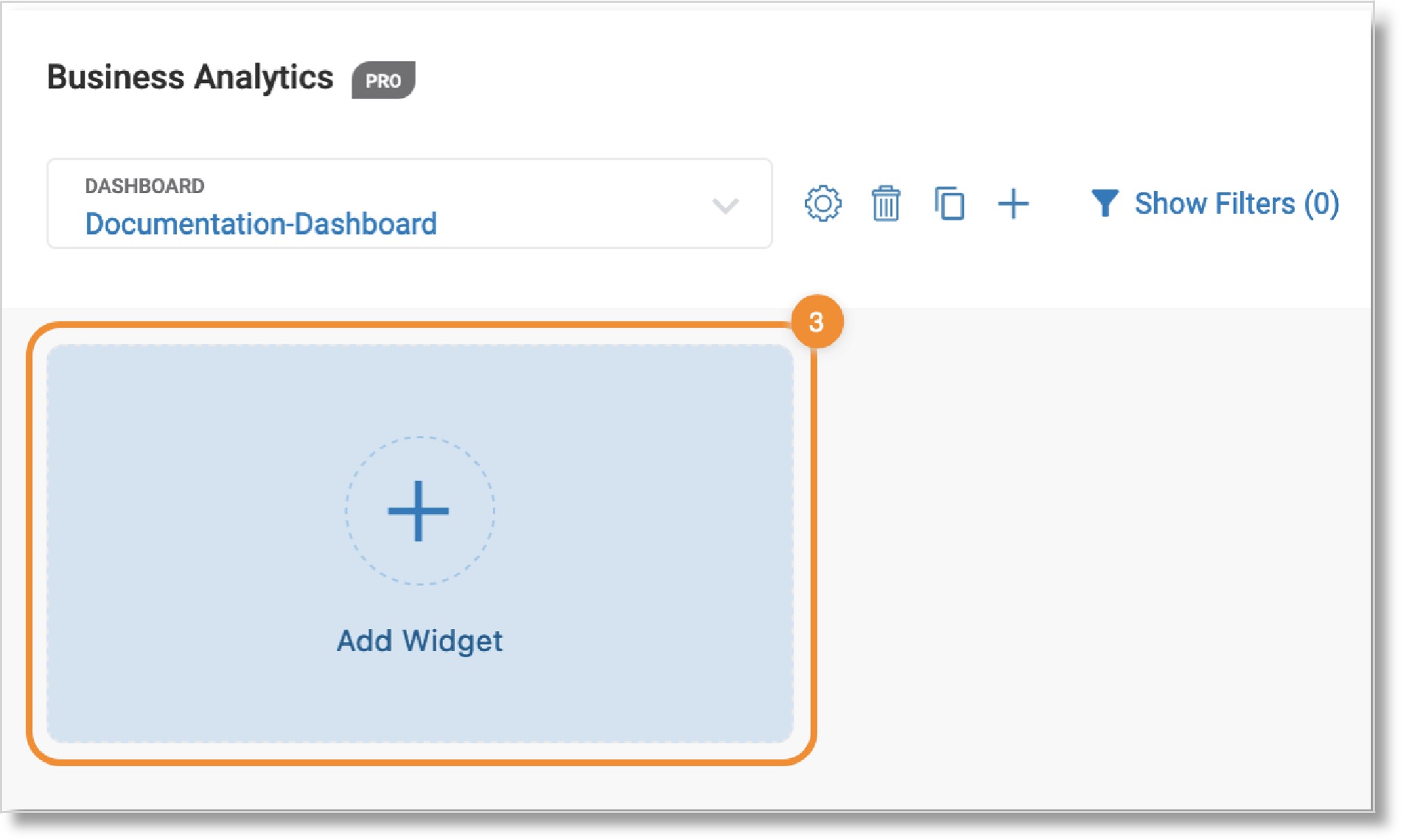
- Click the Add Widget tile.

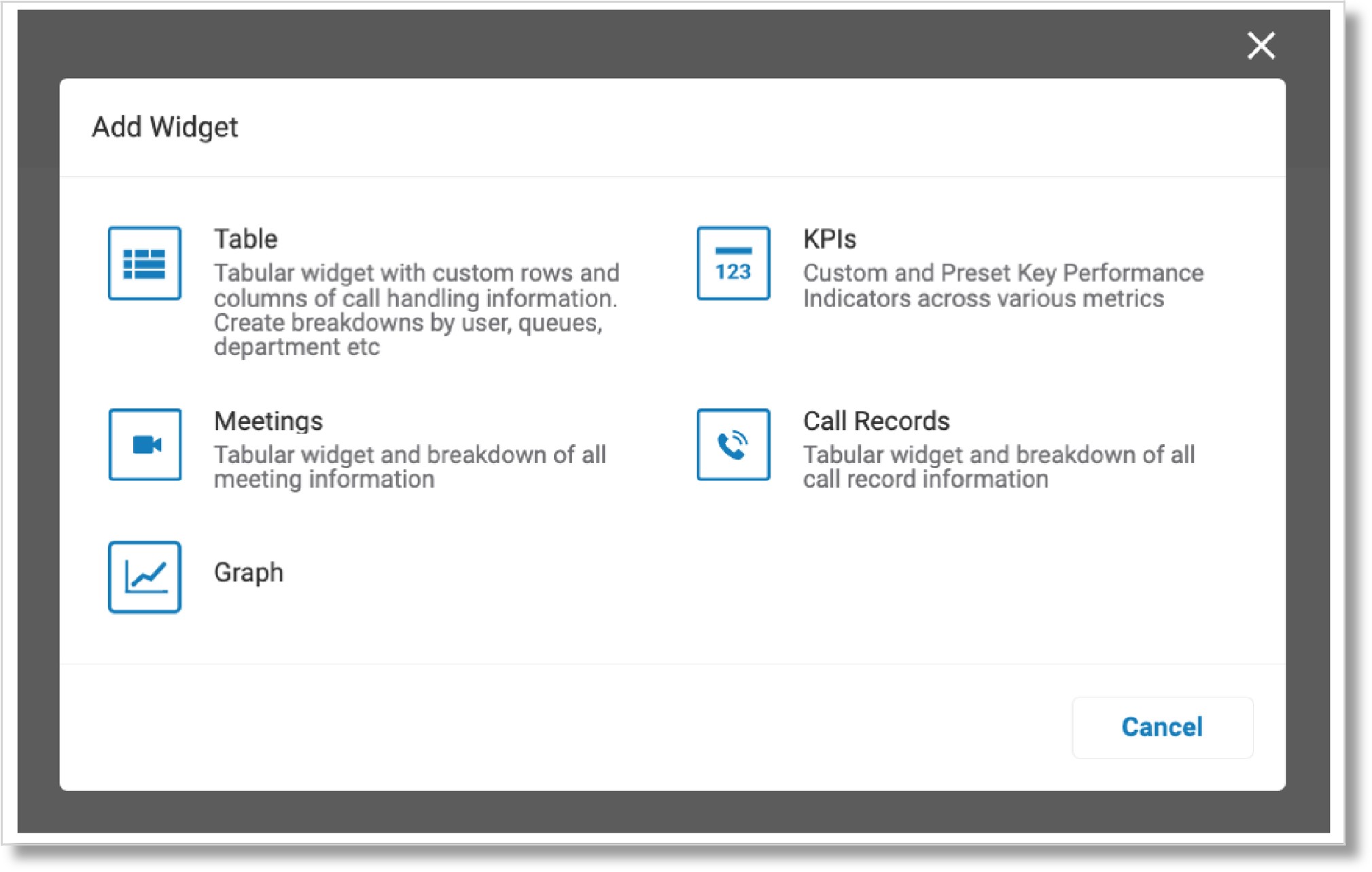
- Select the widgets you want to add to your dashboard.
- Table: Shows in-depth data and performance analysis on such metrics as call performance for a user, a group, or your entire company.
- KPIs: Helps you summarize data into your outlined key performance indicators. You can add KPIs and integrate them into the widget.
- Meetings: Displays metrics for all of your organization’s meetings, including how long each user participates and engages in a meeting.
- Call Records: Shows the “journey” for all incoming and outgoing calls. You can use various customization and filter options to retrieve the exact data you need.
- Graph: Lets you visualize data with an x-axis for the date and time range and a y-axis for data metrics and dimensions.
NOTE: You can create a Trend graph or a Comparison graph. Trends graphs show the most popular times for calls to your organization, while Comparison graphs let you see how data differs between calls.

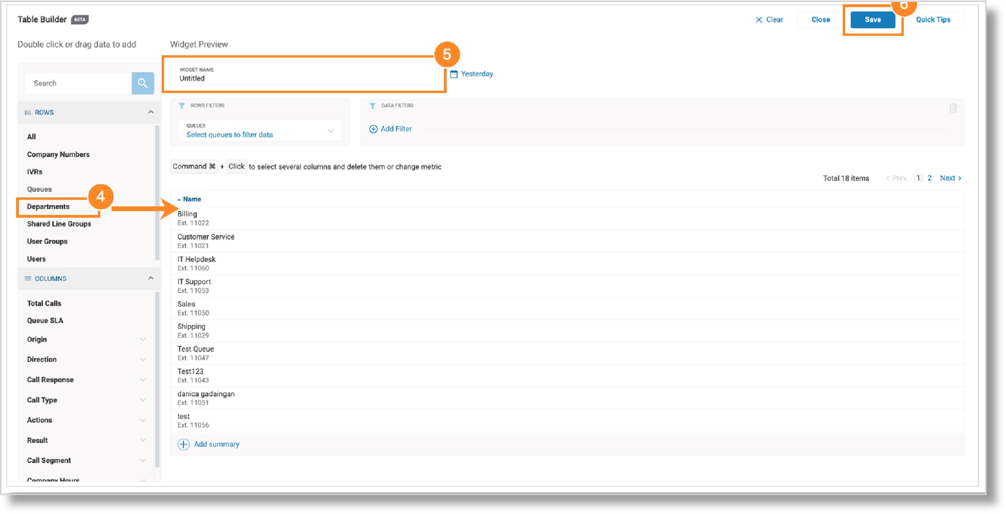
- Pick your dimensions (rows) and metrics (columns) from the left bar as applicable. This will vary by the type of widget you add. For a full list of descriptions for each widget type’s rows and columns, refer to the Business Analytics data dictionary.
- Give your widget a name in the Widget Name field.
- Click Save in the upper right.

Additional resources:
Key Words: AT&T Office@Hand, Business Analytics dashboard, Business Analytics, add widgets, create widget, widget name
Was this page helpful? Yes No
